Government websites don’t necessarily have a great reputation for showcasing top-notch web design but it doesn’t have to be this way! At Somar Digital we’ve worked with a number of NZ Government agencies over the years which has given us a good understanding of how to build websites that not only meet all the usability and accessibility standards but are visually engaging.
UX
New Zealand Government websites have to follow web usability standards as set by NZ Digital government(external link). These standards include simple things such as including contact information and being able to easily print off web pages. To optimize usability though you need to understand the people that will be using your website. We designed and built the website for the Ministry for Pacific Peoples. This website needed to reflect the wide range of cultures within the Pacific Island community. We utilized MPP’s in-depth knowledge as well as carried out UX research so that we made sure that we built a website that spoke to the people that were going to use it.
Writing Style
An often overlooked part of web design is the copy that ends up getting used. It’s all well and good if we build a website that is beautiful and optimized for the user but if the text is poorly written then all that hard work is undone. Because government websites could theoretically be used by anyone it is important that the content of the website is written in plain English so that it is easily understood. Short, simple sentences that go straight to the point are a good place to start. In most cases, the client is responsible for the content of the website but when building the website we’ll set up content blocks in the CMS that are designed so that all the copy fits correctly on the screen and looks cohesive with all the other elements.
Inclusive web design
NZ Government websites need to be inclusive so it can be worth thinking about adding bilingual content for the website. We built the Karawhiua website for Te Hiringa Hauora/Health Promotion Agency, which is aimed at Māori to help prevent the spread of Covid-19. The site is bilingual so the user can toggle between English and Te Reo Māori. We made sure that the website was set up so it is easy for content loaders to make changes to both versions of the site.
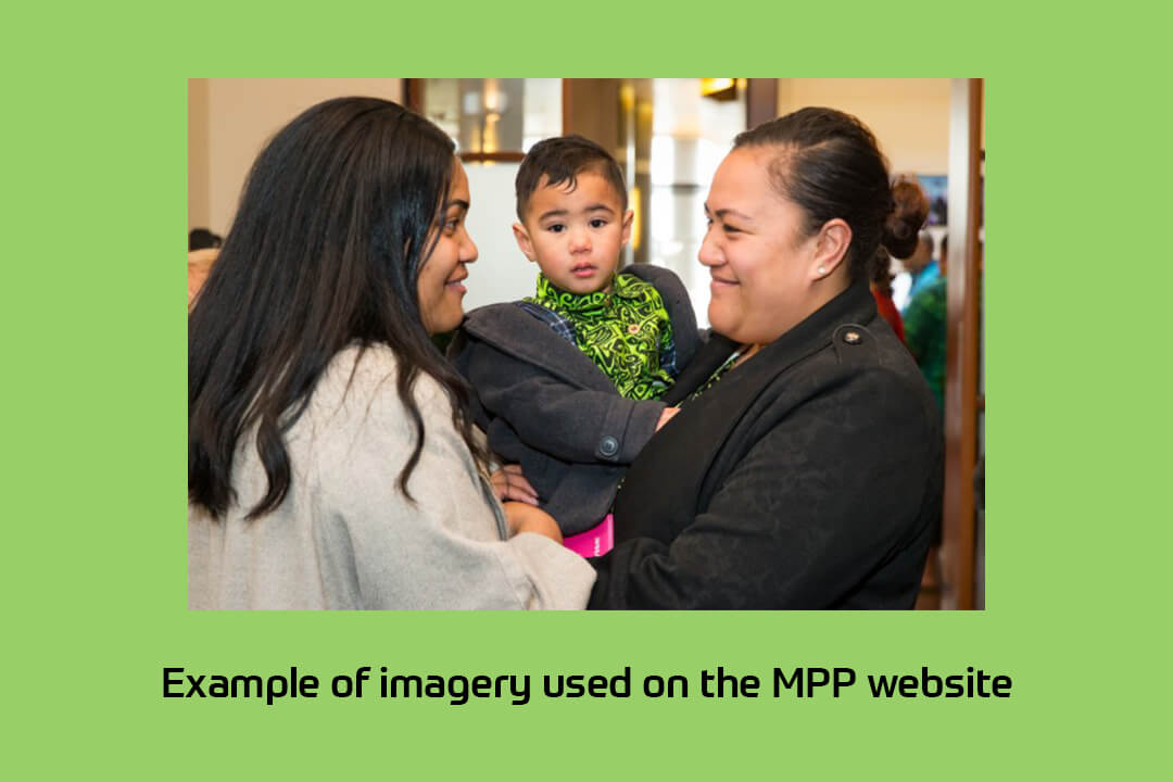
Another good way to achieve this is by including inclusive imagery. The website imagery should reflect the kinds of people that will use the site. It is obvious when stock imagery is used and can make the website feel generic. NZ is culturally diverse and it is important for Government websites to reflect that.
Accessibility
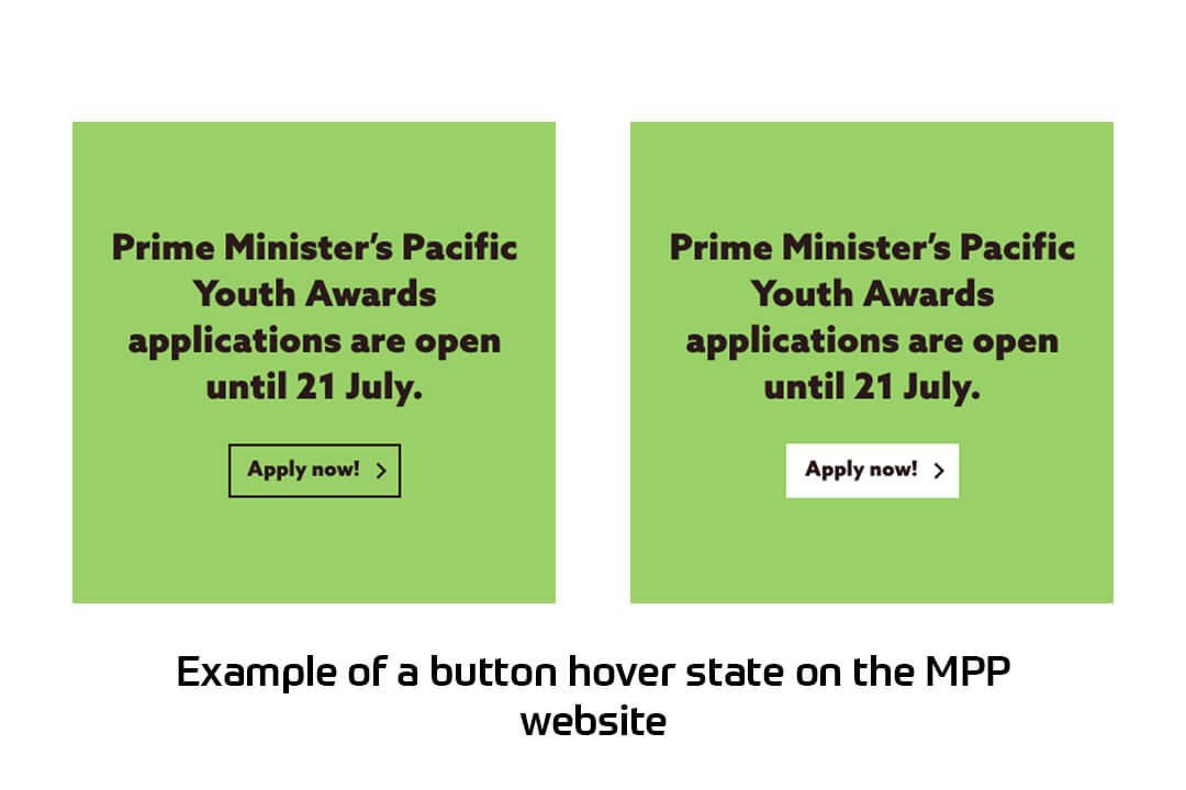
We have written about accessibility before but it is worth a quick reminder that all NZ Government websites need to meet accessibility standards. Examples of this include that the website should be able to used with a screen-reader for visually impaired users as well as making sure there is enough contrast with colours used on the website. The above example shows how we designed the buttons on the MPP website to have a hover state that contrasted strongly with the background. This not only helps people who are colour blind but it's also just good web design to make it as clear as possible to any user which elements of a web page are clickable.
Conclusion
Hopefully, this gives you a better understanding of some best practices for web design for NZ government websites. A lot of these things seem straight forward but it is often surprising how many websites don't do these.
Can we help you with your Government website? We’d love to hear from you :-)