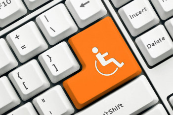
Website accessibility can often be an afterthought when designing and building a new web product but if you want to create something that is inclusive and can be used by everybody then it needs to be a priority. This is especially the case for Government websites. In New Zealand, all public service and non-public service agencies must meet the NZ Government Web Accessibility Standard 1.1.
Why Accessibility is Important
Aside from legal compliance, there are a number of reasons to design with accessibility in mind. There are roughly 15% of people that have a disability, which isn’t an insignificant number of people that might be trying to use your website. You have a responsibility to make a website that can be accessed by anybody regardless of whether they have a disability or not. An accessible website doesn't just help people with disabilities but also older people and it improves the overall user experience of a website in general.
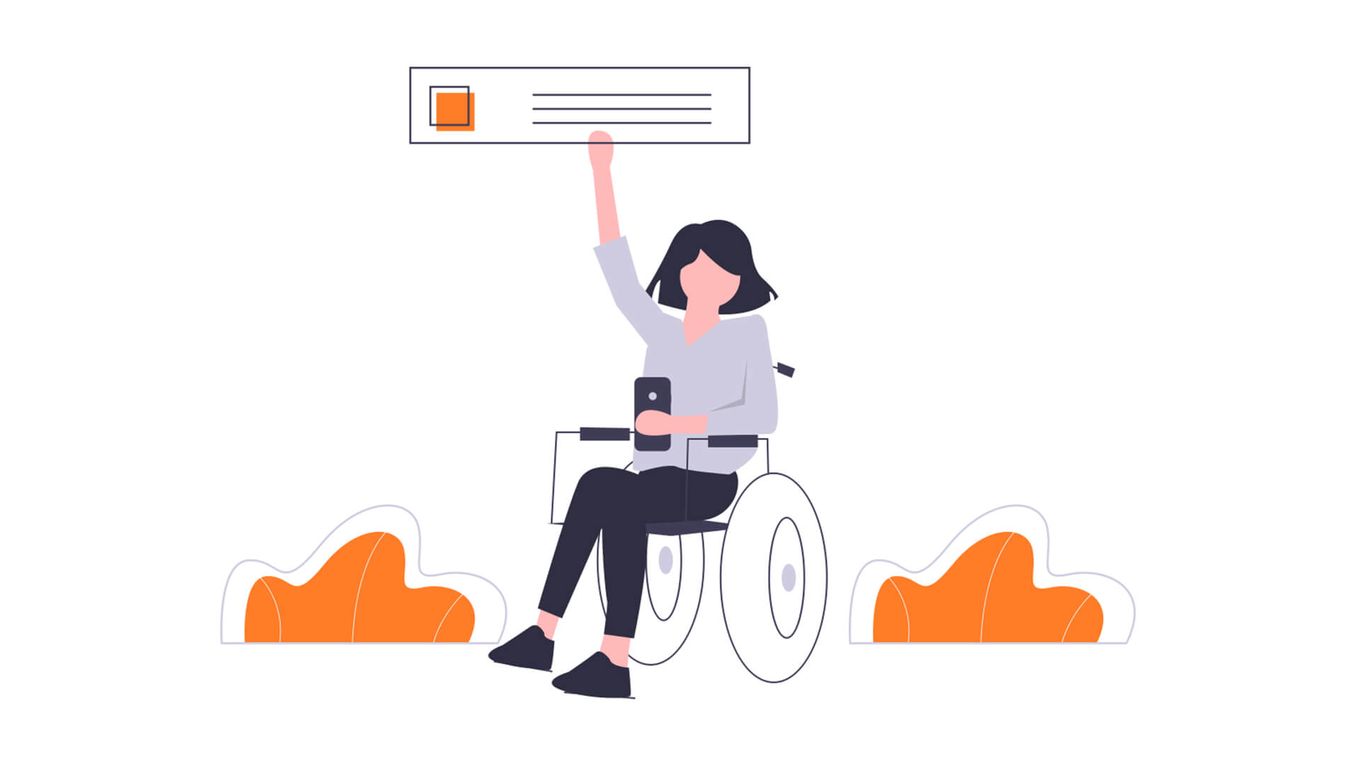
The types of disabilities that need to be taken into account when designing a website include sensory, motor disabilities and cognitive disabilities. So things like using contrasting colours so that people with colour blindness can read text to making sure that the website can easily be navigated with a screen reader so that blind people can use your website.
Accessibility Standards for NZ Government Websites
A rundown of all the accessibility standards can be found on the Digital.govt.nz(external link) website but for now let’s look at some examples of ways that you can make your website more compliant.
Readable text: colour and contrast
Creating a website that has readable content obviously is pretty important, and not just for people with vision problems! This includes making sure that the UI design is accessible, which means everything on your website from the web pages through to any downloadable content can be read. Having an easily readable font is one thing but it needs to be the right contrast level with the background colour.
While it isn’t a Government website, Somar Digital’s work with the Citizens Advice Bureau is a good case in point. The CAB team wrote all the content in plain English so that it could be understood by people with a wide range of reading levels and the team at Somar Digital made sure that this content had the correct contrast to it.
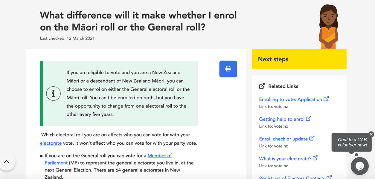
As you can see from the above image this web page on the CAB website features text on a few different background colours but all of the text is still easily readable for the people without vision deficiencies but also people that might have colour blindness. At Somar Digital we also make sure that users can navigate a website with the keyboard.
Navigating via keyboard
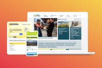
A user being able to navigate a website with just a keyboard is important because some users may not be able to use a mouse or a trackpad. As an alternative, a user should be able to use the “tab” and “arrow” keys to navigate a website in a way that makes logical sense. In other words, if a user uses the “tab” key to navigate it should take them through the web page from top to bottom as opposed to jumping around randomly. It should also be visibly clear where the user is on a web page.
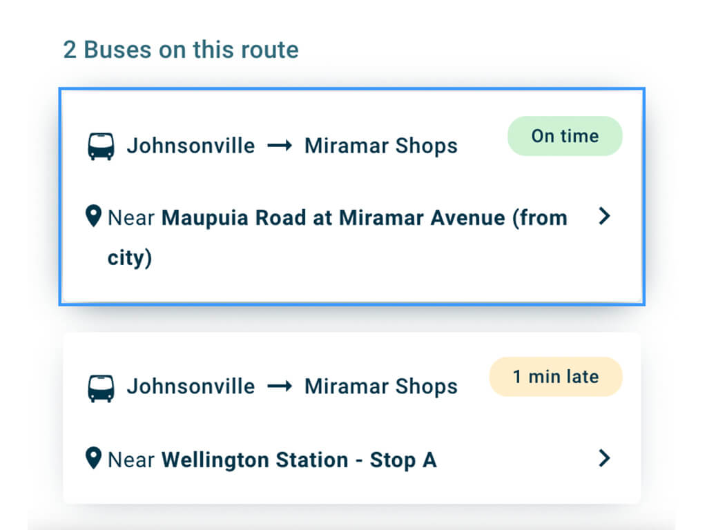
The above screenshot of a section of the Metlink website shows clearly via the blue border and raised tile that where the user is on the “Johnsonville to Miramar Shops” bus route. By clicking on the “tab” or arrow” keys the user is easily able to identify where they are on the web page.
Adding alt text to images
Another common accessibility fix you can make to your website is by adding alt text to images. This is useful because it can help people with vision deficiencies as a screen reader will read out the alt text giving the user an idea of what the image is on the web page. This goes for logos as well as any major visual components to the website.
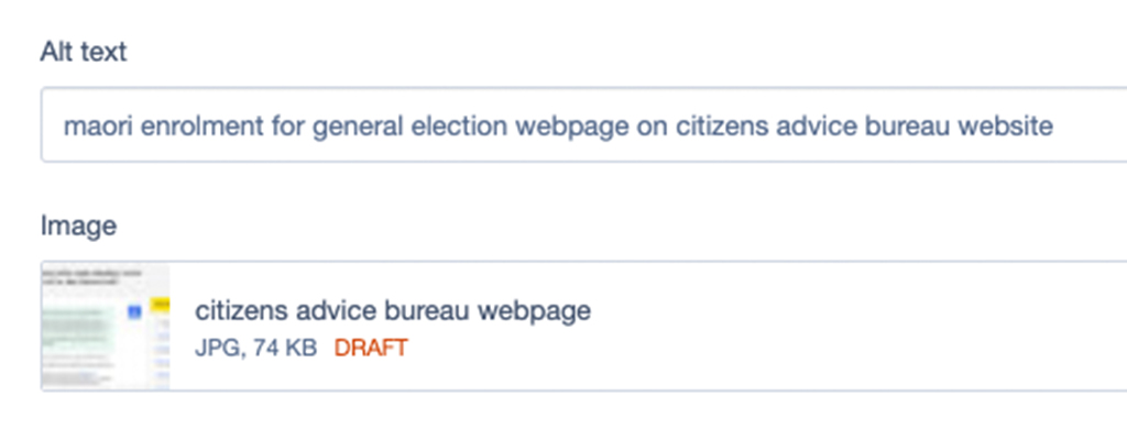
It’s super easy in the Silverstripe CMS for content loaders to add in alt text for images. You don’t need to write an essay, you just need to be descriptive enough so that the user has an idea of what is on the web page!
Captions for videos
The last example we’ll look at today is adding captions to videos. This is pretty self-explanatory but it can be a tedious task. It's important though because it helps anybody with hearing difficulties.
Research has shown though that captions help to keep your audiences attention regardless of whether they have hearing difficulty or not so it’s best practice to add captions to videos anyway. This can be done manually or it is relatively cost and time effective to get a third-party company to do it for you.
Conclusion
Following the accessibility standards is mandatory for NZ Government websites but it can be done cost and time effectively. At Somar Digital we had help from external testers who gave us a heap of feedback on what we needed to change to make the Metlink website and App accessible before we launched it publicly. This meant that any users with any disabilities would be able to use the app and website straight away saving our client money and time down the line.
Do you need help with your Government website? If so we’d love to hear from you!