Whether someone is checking bus times on their commute, filling out a government form, or donating to a charity, the experience they have on a mobile device shapes how they feel about your organisation.
This blog covers what mobile UX is, why it matters, and the core principles behind getting it right.
Key Takeaways
- User experience (UX) for mobile refers to how people interact with a website or application on a mobile device, and how easy, intuitive, and accessible that experience is.
- Mobile UX requires different design decisions to desktop, because the context of use, input methods, and screen constraints are fundamentally different.
- Good mobile UX reduces friction, increases engagement, and builds trust with your users.
- Accessibility is a core part of mobile UX.
- Somar Digital takes a research-led, user-centred approach to designing effective mobile experiences for New Zealand organisations.
What is User Experience for Mobile?
User experience for mobile covers everything that shapes how a person feels when using your website or application on a smartphone or tablet. This includes how quickly content loads, how easy it is to navigate, how clearly information is presented, and whether the design accounts for the physical realities of using a touch screen.
Mobile UX applies to two distinct contexts: mobile-responsive websites, which adapt to smaller screens within a browser, and native mobile applications, which are installed on a device. While both require a user-centred approach, they involve different design and technical considerations.
Why Mobile UX Matters
People arrive at a mobile digital product with less time, less patience, and more potential for distraction than they might have at a desktop. A confusing layout, slow load time, or form that is difficult to complete on a small screen can be enough to drive someone away, and (depending on your organisation) that might mean a missed service, a lost donation, or a resident who cannot access the information they need.
Mobile devices are also, for many people, their primary means of accessing the internet. Designing a strong mobile experience is therefore a matter of inclusion as much as it is good practice.
Beyond user satisfaction, mobile UX has a direct impact on measurable outcomes: bounce rates, task completion, conversion, and return visits are all influenced by the quality of the experience on a small screen.
Mobile UX vs Desktop UX: Key Differences
Mobile and desktop are fundamentally different environments. Designing for one does not automatically produce a good experience on the other. The key differences are:
- Screen size and layout: constrained space means content must be ruthlessly prioritised. Everything on a mobile screen competes for limited real estate.
- Touch vs mouse input: tap targets need to be large enough for fingers, and interactions need to account for swipe gestures, thumb reach, and the absence of hover states.
- Context of use: mobile users are often multitasking, outdoors, or on the move. Complexity is a bigger barrier than it would be on desktop.
- Performance: mobile users are particularly sensitive to slow load times, especially on variable connections.
- Progressive disclosure(external link): presenting information in layers, rather than all at once, becomes more important when screen space is limited.
Core Principles of Good Mobile UX
Strong mobile UX is built on a consistent set of principles, regardless of whether the product is a website or an application.
- Simplicity: fewer steps, less clutter, and clearer calls to action. Every element on a mobile screen should earn its place.
- Thumb-friendly design: placing key interactions within comfortable reach, and sizing tap targets to reduce errors and frustration.
- Performance: optimising images, reducing unnecessary scripts, and ensuring fast load times on mobile connections. Speed is a UX consideration, not just a technical one.
- Accessible design: mobile UX must account for users who rely on screen readers, voice control, or screen magnification. Adhering to the Web Content Accessibility Guidelines (WCAG) is the standard benchmark, and for New Zealand government organisations, the NZ Government Web Standards apply. For more detail on accessibility requirements, see our website accessibility guidelines blog.
- Consistent navigation: familiar patterns reduce cognitive load. Users should not need to learn a new system each time they return.
- Responsive layouts: content that fluidly adapts across screen sizes and orientations, without requiring the user to zoom or scroll horizontally.
- Clear feedback: loading states, form validation, and confirmation messages ensure users always know what is happening and what to do next.
Signs Your Mobile UX Needs Attention
It is not always obvious when a mobile experience is falling short. These are common signals worth investigating:
- Higher bounce rates on mobile compared to desktop
- Low task completion or conversion rates on mobile
- User feedback mentioning confusion or difficulty
- Forms that are hard to complete on a small screen
- Slow load times on mobile connections
- Navigation or content that does not adapt well to different screen sizes
If any of these resonate, a UX review is a practical starting point.
How Somar Digital Approaches Mobile UX
At Somar Digital, we take a research-led approach to mobile UX – starting with understanding the people who will use the product before any design decisions are made. That means user research, collaborative workshops with clients to align on goals, prototyping, and usability testing on real devices.
Accessibility is built in from the outset rather than retrofitted later. And because we work closely with government agencies, nonprofits, and public-facing organisations across New Zealand, we understand that the stakes for getting the experience right are high.
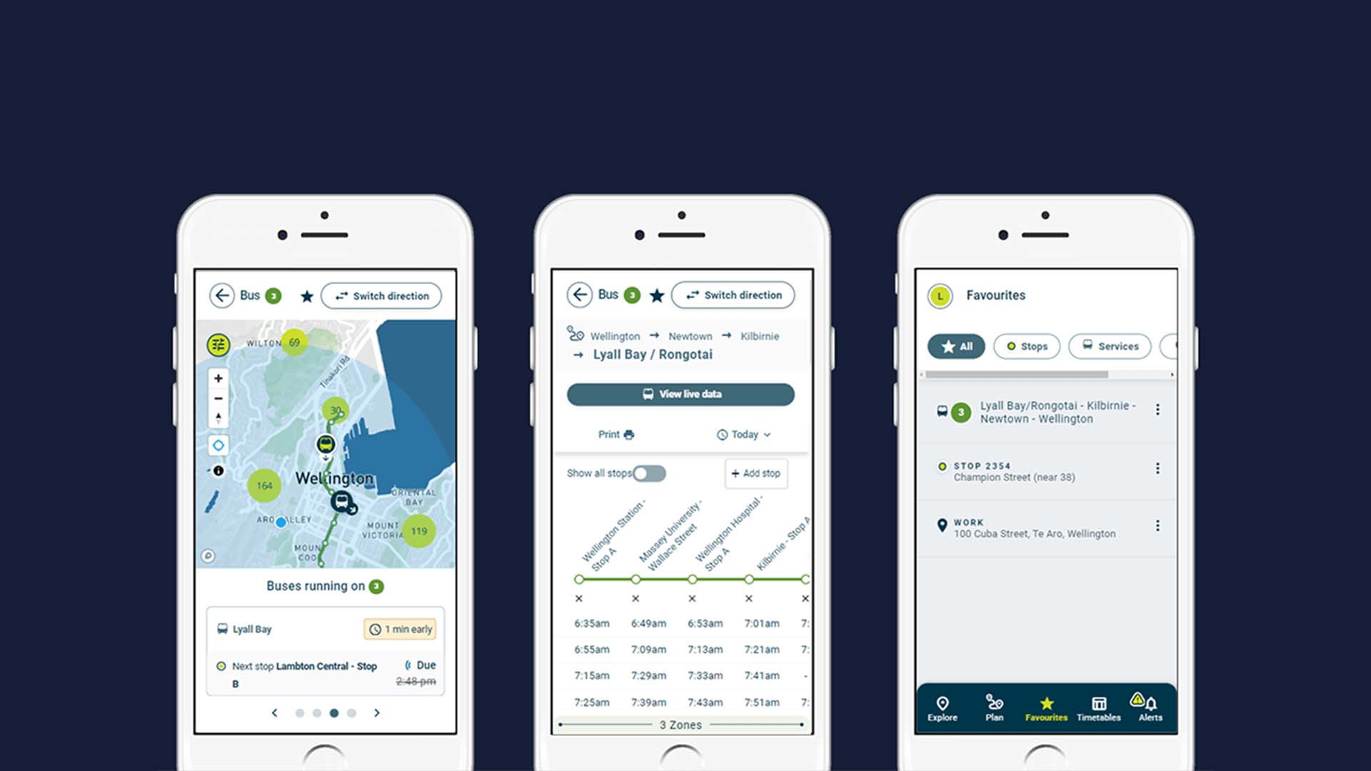
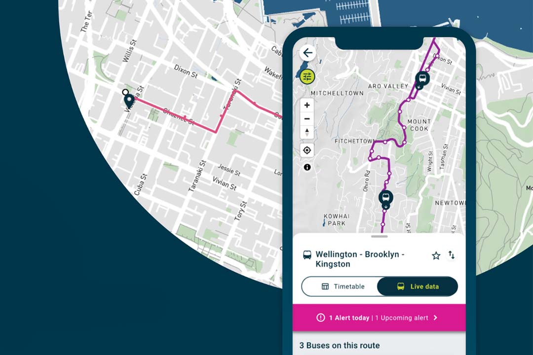
Our work with Metlink, Wellington's public transport provider, is a practical example: a platform used by tens of thousands of commuters, where mobile usability directly affects whether people can get where they need to go. You can read the Metlink case study here.
If you are thinking about improving the mobile experience on your website or application, we would be glad to help. Get in touch with the Somar team to start the conversation.