
Figuring out how your customers and users are going to navigate your website or App in a way that is user-friendly and that isn’t going to frustrate them is one of the most important things to get right when thinking about user experience (UX). There are heaps of ways to improve your website navigation but for this blog, we’ll limit it to 6 essential best practices for your website navigation.
Main navigation: less is more
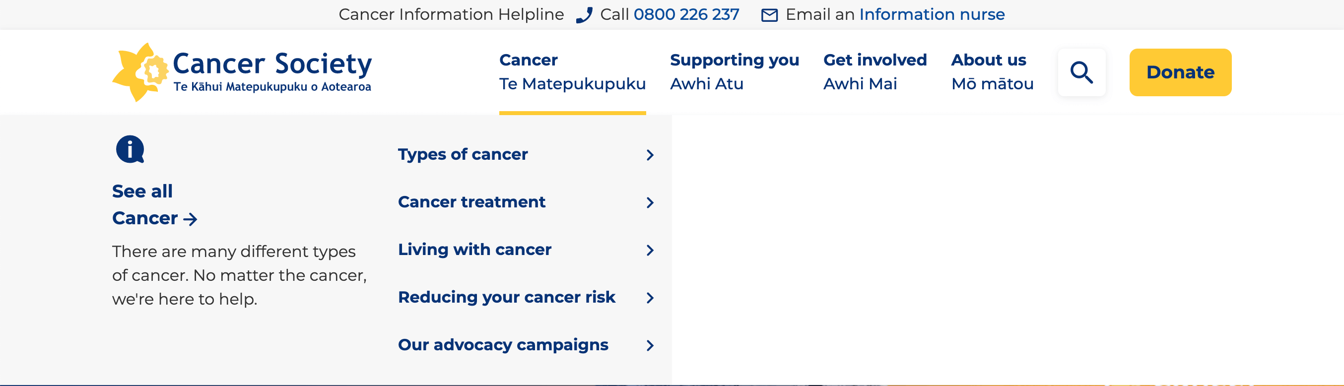
It can be useful to first think about content hierarchies when you want to create good UX design. In other words, before we build we need to prioritize what it is your website is used for. Users always come first. Remember that being conventional isn’t a bad thing. You can be creative with your website but when it comes to the navigation it’s best for the user if you stick to established ways of navigation. For the Cancer Society website, we kept to four items on the main navigation plus search and donate buttons. Each item drops down to reveal related parts of the website but it is clearly organised by what a user comes to the Cancer Society website for.
Main navigation: label correctly
You want users to know where they can find the things they’re looking for on the website. Plus it also helps with SEO as search engines will be able to understand your website better. Think against using jargon and instead use plain english and be descriptive and to the point. But you still want to use language that your users will understand. It is immediately obvious on the Cancer Society what each item on the main navigation represents and where it will take users on the website.
Website Responsiveness
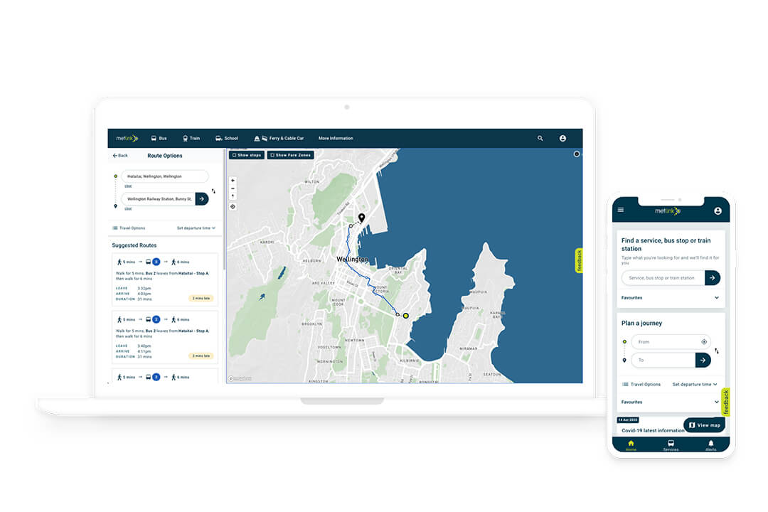
From a usability point of view, a website needs to be navigable on different devices. A good example of this is the difference of where the main navigation is placed on the Metlink website and App. The website has the main navigation placed at the top of the page like the majority of websites but for the App, it is placed at the bottom of the page. This is because when you're using the Metlink App on your phone it is easier for a user to reach the main navigation using their thumb when it is at the bottom of the page. Another common approach is to change the main navigation into a burger menu when using a website on a smaller screen so that the main navigation doesn't feel too cramped.
Think about the entire website, not just the homepage
A common mistake is prioritising navigation from the homepage and neglecting other ways users will explore your website. For example, not all users will start on your homepage especially if they have been searching for something specific on Google. The company logo doubling as a homepage button is commonly used shortcut for most websites. On the Somar Digital website, we created a section about our services but when we tested the original design we found that once a user clicked on 'UX Design' they weren’t easily able to get back to the main services page again. We added a drop-down to the main navigation menu so that it was easy for the user to switch between the different services.
Include search when necessary
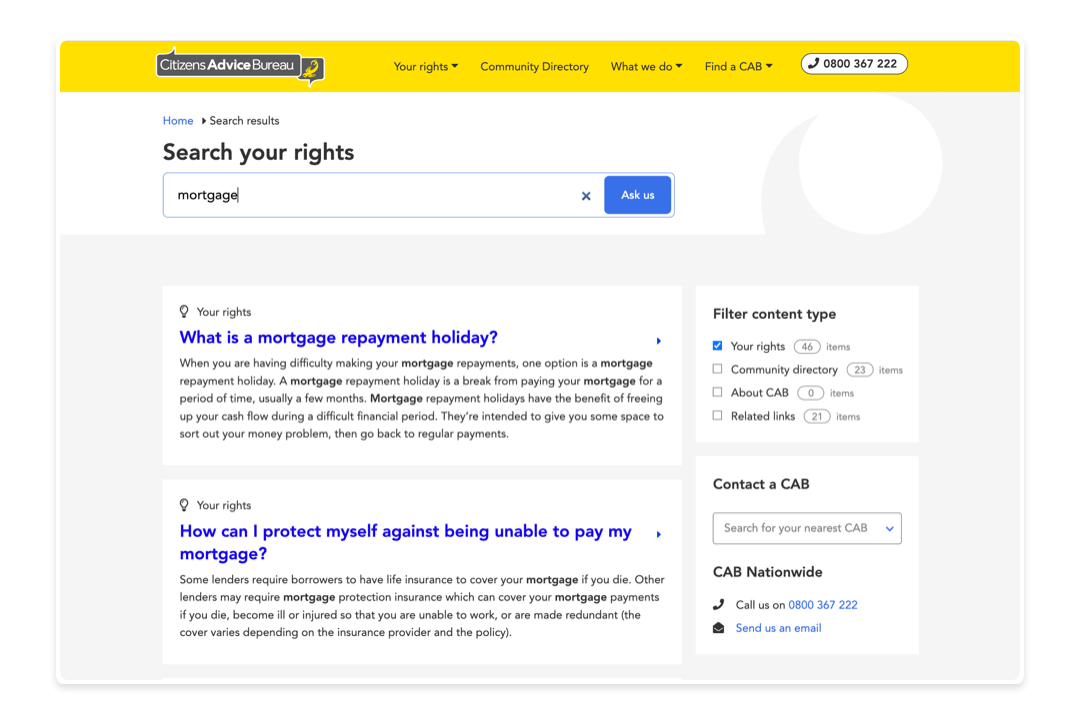
Some of the websites we’ve built contain a heap of data and content. It can often be difficult to organise everything so that it is easy for users to get to. Aside from organising content logically and labeling everything clearly, it can also be super helpful to the user if you add a search function to the website. This can be part of the main navigation bar or it can be a central part of the homepage as is the case with the Citizens Advice Bureau website. Because there are tens of thousands of pieces of content on the website, ranging from your rights as an employee to immigration information, a search bar needed to be placed front and center on the homepage so that users could quickly access the information they needed.
Conclusion
Figuring out the navigation of the website is one of the first things we try and lockdown with our clients’ to create good UX design before we start building the website so hopefully this blog gives you a few ideas about how to follow best practices.
Are there any other best practices you would add?
If you want to chat with us about how to make your website more user-friendly then you can contact us below.