In previous blogs we have looked at the difference between UX and UI design. Today we are going into a bit more detail about some best practices around UI design. These are useful to keep in mind so that you find a good balance between designing a website that is visually appealing but also functions best for the user.
Simple UI design
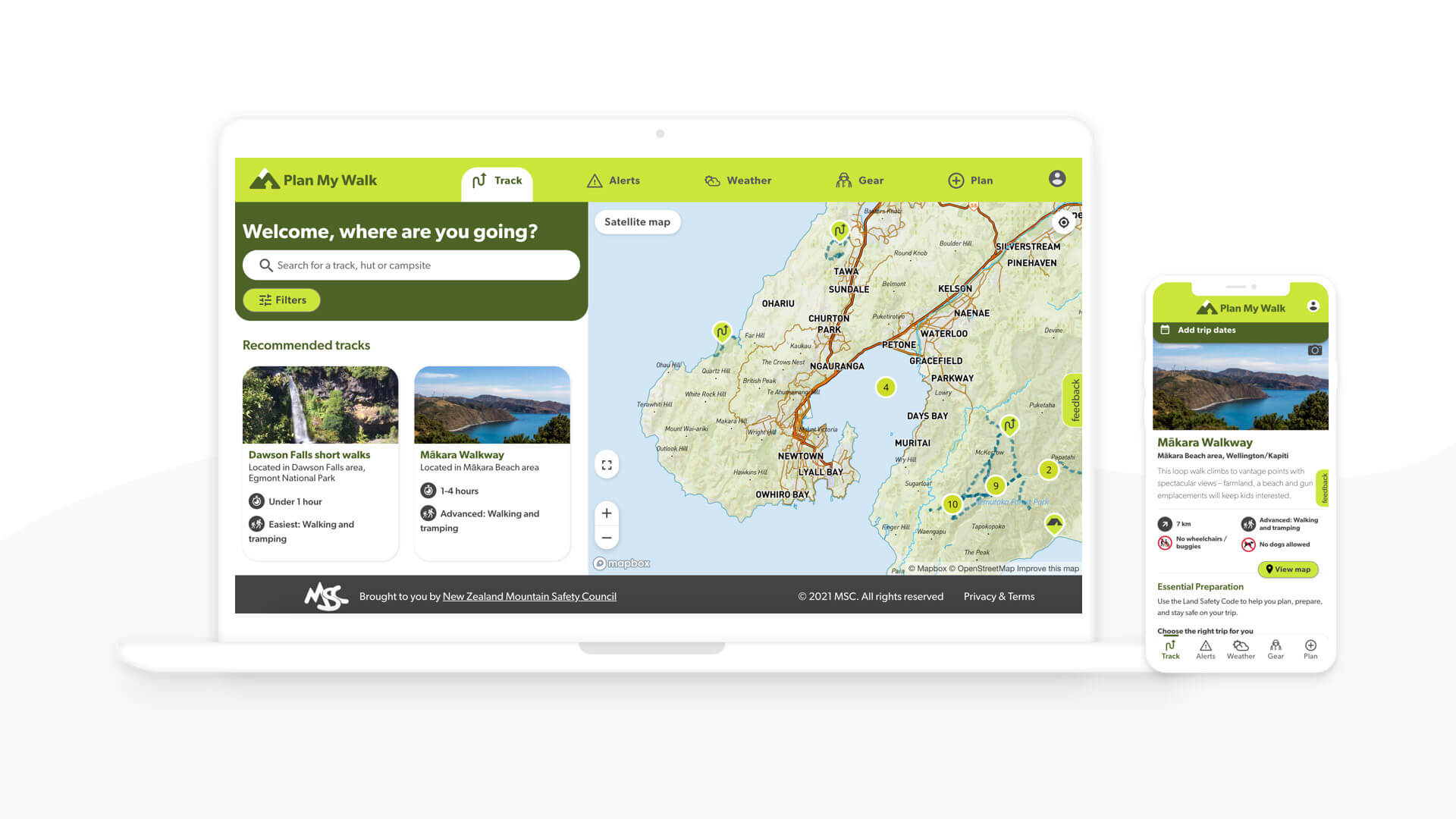
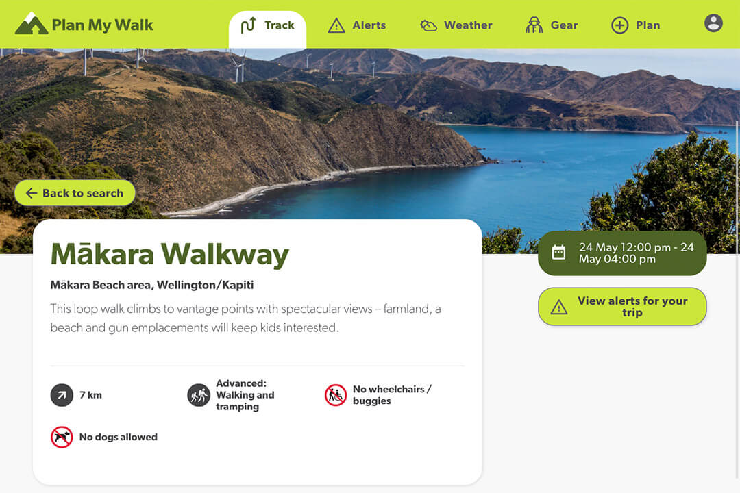
Some of the best UI design is invisible to the user in the sense that any distracting or unnecessary elements are removed. When designing your website you only want to keep the most essential parts of the UI. Labels and buttons need to be labeled clearly and you want to use language that the user will understand. The Plan My Trip app that Somar Digital built is a good example because we understood the types of people that would use the app and used UI best practices based on this research. This helps to create a seamless experience for the user that helps them achieve whatever it was that they came to the website for.
Help the user
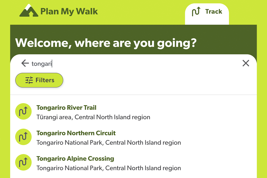
Where you can you want to try and anticipate the actions that a user will take when using the website. Something we've done a lot at Somar Digital is build intuitive search functions into our client's websites when appropriate. We use Elasticsearch which has a feature called fuzzy search that can suggest search terms for users as soon as they start typing in the search field. It will also suggest similar or relevant search terms even when a user misspells the search term they are looking for. These features help remove possible frustrations that a user may have trying to find what they are looking for.
Consistent UI elements
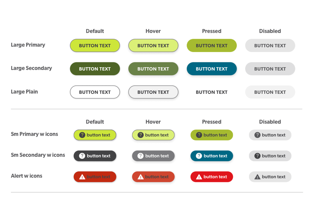
Keeping consistency with your UI throughout the website by using common elements like buttons, icons and fonts help users feel more confident using it. Once a user reaches your website no matter if it's the home page or a landing page about one of the services you provide they should instantly understand that page's purpose and how to engage with it and the same UI elements should carry across the entirety of the website. Before we began building the Plan My Walk app our designer put together all the UI elements, including things like how buttons would look in their hover state, colour palette and font types so that they could be incorporated throughout the design.
Typography
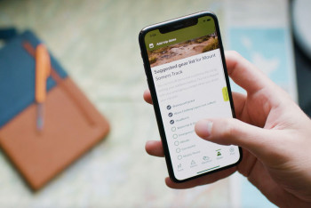
Carefully consider how you use the typeface. Different sizes, fonts, and the arrangement of the text can increase scanability, legibility, and readability. Choosing a font that is representative of your brand but that is also easy to read online on different screen sizes is a good first step. You can also think about having a balance of words and images so that your website is more visually engaging. Text-heavy web pages could put off a user so being concise with your copy and being clever about how you layout the page with words and images can go a long way to designing good UI. The Plan My Trip track pages feature a lot of useful safety information for users but is balanced out by strong imagery and icons.
Colour
Our Somar Digital designer worked closely with the Mountain Safety Council designer to for the colour scheme of the Plan My Trip app. Thinking carefully about the colours you use on a website is vital because it can help direct a users attention towards something important, like a call-to-action. You also want to make sure that there is enough contrast between the colour of the UI elements and the font colour so that the website meets accessibility standards. The Plan My Trip has a well thought out colour scheme that uses primary brand colours and secondary colours to add contrast and keep the design engaging to look at.
Conclusion
To sum up we looked at 5 UI design best practices:
- Simple design to remove distracting and unnecessary UI elements
- Help the user where possible like suggesting search results
- Consistent UI elements like buttons, font, and colours
- Carefully think about typography including font and overall layout
- Use strong brand colours that introduce contrast and engage the user
Do these sound like they could help out your digital products?
Is there anything you would add to the list?
If you want to hear more about how Somar Digital can help out click the link below :-)