It almost goes without saying but designing a website that can work seamlessly with any device no matter the screen size is essential if you want users to easily use your website. Making sure that a website is responsive is an integral part of the web design process and there’s a lot of fine-tuning that goes on in development to make sure the user experience is optimised. So what exactly do we mean by responsive web design and what goes into making sure this happens?
Defining Responsive Web Design
Responsive web design is taken into account throughout the entire design and development stages of a project that considers screen size and platform in relation to how the user behaves across the website. The website needs to be able to conform to the myriad types of devices and screen sizes that a user might interact with the site. This doesn't mean that we have to build a website for every device (or future device) on the market. Instead, we design a site that is flexible enough, using elements like flexible grids and layouts, images and CSS media queries, that can respond to however the user may be using the website.
Why Responsive Web Design is Important
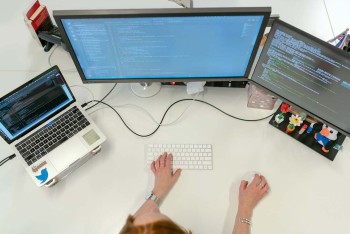
On average over 50% of internet traffic is from a mobile device but at Somar Digital we like to do our own UX Research with our clients to figure out how their customers are using their digital products. During the design process we mock-up designs for mobile, desktop and tablet so that the website has a consistent look and feel across all devices and screen sizes. We spend a lot of time in the development stage testing these designs so that the website is optimised for the intended user. If your website works great on desktop but isn't usable on a mobile device then you'll have a hard time getting customers and users to return to your website.
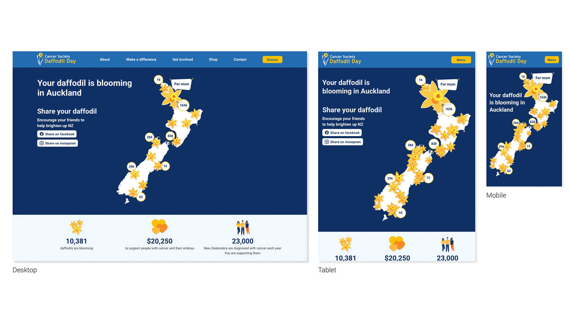
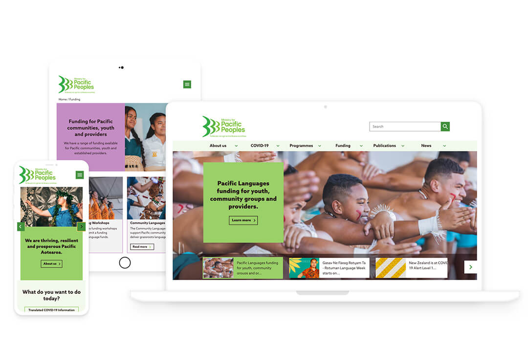
Examples
Flexible Grids and Media Queries
Flexible grids help ensure that the content on your website will fit the myriad of devices that your users may have. Flexible grids consist of columns that adapt to the size of the screen. Within these grids all elements that make up a web page, like text and images, are found. Media queries help us to adjust designs based on the properties of the user's device. Flexible grids and media queries help ensure that these elements, like images and text, stay consistent and legible no matter the screen size. In other words, the overall UX shouldn't change drastically when using a mobile device or a large desktop screen.
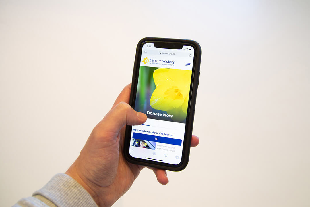
Images and Text
Web content needs to be optimsed so that a website can be responsive. We encourage using SVGs where possible for things like illustrations and icons. SVGs alter their resolution based on image paths, not pixels, so you don't need to worry about icons looking pixelated on larger screens. At Somar Digital our developers set up the CMS so that when it comes to our client's uploading content into the site images display properly. We'll often leave recommendations in the CMS so that it's as clear as possible the dimensions of the images that need to be uploaded so that nothing looks amiss. We'll also test thoroughly to make sure that the text is formatted correctly. Often we'll work with the client to figure out character limits for different parts of the website so that the copy is readable on all screen sizes.
Conclusion
Hopefully, this gives you a better understanding of what responsive web design means. Our designers and developers will handle all the complex technical stuff it’s just a matter of communicating what you want from the website and understanding how your customers will use the website.
Are we able to help out with any web design projects?