
The term ‘responsive design’ gets thrown around a lot in our industry, yet a surprisingly large percentage of websites in New Zealand don’t follow this International standard.
The term ‘responsive design’ gets thrown around a lot in our industry, yet a surprisingly large percentage of websites in New Zealand don’t follow this International standard. Coined in 2010 by designer Ethan Marcotte, ‘responsive design’ covers a set of techniques that allow one flexible web design to serve multiple different screen sizes.
In a country where over 70% of users rely on a portable device such as a mobile phone or tablet for visiting websites, it’s alarming that more companies aren’t ensuring their sites look great on smaller screens.
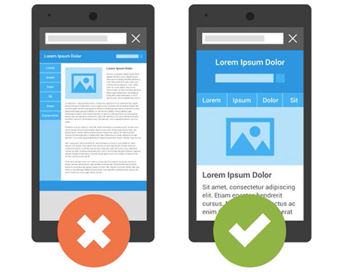
While nearly every website is viewable on a mobile device, usability can be severely hindered. For instance, when users don’t have the accuracy of a mouse cursor, then buttons, links and interfaces need to allow for more clumsy finger taps.
Text legibility can also suffer if a website doesn’t adapt to a smaller screen, and good responsive design will use typography that works with less real estate.
Designing a responsive website changes depending on the client’s needs. However, there are a few key design principles that Somar engage with every project:
- We plan and design to suit the content: Before we start wireframing, we want to understand your site’s most important messages, what kinds of content will be used to communicate them, and how each element will be prioritised. This helps engage with your key audience effectively and efficiently.
- We build fluid, flexible layouts: Unlike print design, there are no set canvas or page sizes in digital. Websites need to stretch or condense to fit any screen, from a 42” television down to a 5” phone, so we rely on percentages and ratios rather than fixed sizes when mapping things out.
- We design elements that intelligently adapt when layout breaks: For example, sidebars or menus might be moved to the top or bottom of a page so users see the important information first.
We also give careful consideration to how users navigate websites on mobile. People on the move often require different information at a faster rate than someone on a desktop. Contact information, for example, is a commonly requested mobile feature. Somar will look at user behaviour and adjust the hierarchy of the site to suit.
Finally, to reinforce the importance of good responsive design, Google has now announced that websites that are not fully responsive will be ranked lower in result pages than those sites that are. This means anyone who wants to be discovered via keyword searching through Google should definitely make sure that their online presence is fully responsive.
Somar are experts in UX design, embracing digital solutions that work across all devices and technology. If you need help bringing your website into this exciting new world, drop us a line.
